Annette Massager's Homemaker's exhibition, curated by Ann Caxon and Valentina Ravaglia located in room eight, shows how women have been oppressed in a patriarchal world. The exhibition contained other artists such as Tracy Emin, Rosemarie Trockle, Margaret Harrison - all of which displayed work through art textiles. The use of this media shows how the role of women were pushed into this type of career from the second World War and the 60's. It personally felt like the use of textiles was overpowering and seemed as if female artists at this time of gender inequality, expressed only their oppression through this type of media. Tracy Emin's, Hate and Power Can be a Terrible Thing (2004), shows how women in 1963 have become more open psychology - This is shown by the aggressive language used in the textile installation: Phrases such as 'Rot in hell'. This felt like it was an outburst of feelings from the pressure of patriarchal society.
Looking at the other artists work, I can see why the pieces of artwork have put into an exhibition. They compliment the style of art textiles as they each tell a story, with one exception: the dark wall hanging piece was too dark and the detail was drowned out by the background colour. Despite this, this piece complemented the surrounding artwork because it had as somber and off key style. On this note, the experience whist being in the room, was comforting because of the use of soft textures used, but the illustrations and messages conveyed, created a haunting feel to it. This is because as a whole, the feelings portrayed were negative - this contrasted with some of the colorful and bright colors which represent represent happiness. There was a harrowing emotion felt due to the immediate interpretation having a dissimilar connotation to the meaning that lay beneath.
Thursday, 19 September 2013
Wednesday, 18 September 2013
Identity & Self - WEEK 2 - Trend and Styling
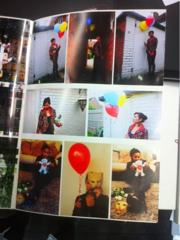
This weeks assignments have allowed me to focus on how trends greatly impact the work and world around us.
The trend research helped to inspire the make up and styling of my photoshoots, however I only used trends that were in relation to my photoshoot concept. For example I used monochrome shades, white and black, to exaggerate the two sides of my personality. In addition I took other photos where I am wearing a black blazer with oriental style and embroidery - a style seen in some high street shops. I decided not to use colours, despite pastel colours such as rose pink were on trend, because I felt this would portray a different message, rather than focusing on contrast. During the trend research presentation, I found that the group I worked in were excellent at collecting relevant research, although I believe my personal improvement would be to work on my presenting skills. For instance to make the presentation have a clearer message by using bigger pictures and eliminating images that weren't particularly strong.
I enjoyed taking and producing the photos that were presented at the end of the week. I found it quite difficult trying to convey my personality into them without being un original or clichè. Initially I wanted to portray my dark insecure side and contrast it against my outgoing side, which almost acts as a shell. I decided I didn't want to go through with this idea because I thought the outcome would look uninteresting. Despite this, I still wanted to play around with the contrast idea and link it to the black and white monochrome trend. My new concept idea was to show my obscene side that is blurted out unexpectedly even though my friends see me as innocent. I showed this by using objects that were seen as 'bad' or deviant to exaggerate this concept. I also wanted to show how I want to keep in touch with my childish side because I feel I have lost out or grown up too quickly. I showed this by using objects associated with pureness and children. I was able to show this through styling (white and black outfits). With the black outfit, I tried to use the oriental theme/trend River Island used.
After taking the photos, I edited the photos with the black outfit with high saturation to make me look out of place. I used this same concept with the photos where I'm wearing white (saturation of colour to almost monochrome and contrast was turned high) to give the photo a grungy look. In the end, I thought the photos wearing white were the lost effecting ones and decided not to show the black outfit photos. This was because they presented a stronger message.
These photos reflected the concept images I found in a book on japanese goth, because the images were cute, with a disturbing quality to them which I thought worked for my concept. It shows how my 'innocent' persona can be seen as disturbing when I say or do something unexpected.
If I had more time, I would produce a short film because I think it would be interesting to experiment with to create certain effects. I will continue this concept throught my work because I think it works quite well, although I will adapt it to specific tasks.
Tuesday, 3 September 2013
Identity & Self - WEEK 1 - Research Development
The tasks this week were really useful - the questions I answered about myself allowed me to identify who I am as a unique person, and how I'm similar to other people as well.
I enjoyed this activity and thought it was beneficial because it's inspired me to delve deeper into my personality as well as understanding what makes me an individual.
Later on in the week, I became more inspired by what i had collected about myself. for instance, using my physicality was a good starting point because they were easy to abstract. In terms of development, I used Photoshop to edit, repeat, rearrange, etc. the images to create different designs.
On the first day found that I needed to think about the second task more carefully, because I felt that my memories I placed on the table had become mere objects. This was due to the fact they weren't in a surrounding that was memorable to me. Although, talking about my memories made me feel like I was reliving the memories again.
I drew/painted my images by using the emotions and feelings I felt through reminiscing. This is what makes my memories unique to me, because anybody could look at my memorable objects, but wouldn't be able to interpret them the same way I would.
Collecting certain images and objects helped with developing colour swatches. Using my mind map to obtain abstract words, has shown me who I am despite how others perceive me. Its almost like I have 2 personalities, or layers to my personality, which are expressed in certain situations and environments. The mind map has also shown me that I am quite a contradicting character. I would like to use opposites in my work to show this type of characteristic.
 |
| Mind map: resulting in abstract emotions |
 |
| Physicality |
The most successful image in my sketchbook today is the painting of the pink novelty whistle, because I enjoyed experiencing it again by creating it through another form of media. I enjoyed using colours freely in order to make the memory seem more abstract.
 |
| Pink Novelty Whistle |

As an improvement, I felt like I needed to experiment with with my memories further, but wasn't sure how to do this - I'd like to see if any feedback would help with this.
I think I need to be more hands on and impulsive, rather than thinking about the task for too long - otherwise I won't get anything done. I might do this by developing simple aspects of my research rather than think how this is going to become a garment or textile without developing it.
I want to experiment with dreams, because they are unique to me and my lifestyle, therefore I will start a dream journal and the descriptions to create abstract artwork. In addition, I will concentrate on using different media to create interesting designs and textures.
Subscribe to:
Comments (Atom)