The trend research helped to inspire the make up and styling of my photoshoots, however I only used trends that were in relation to my photoshoot concept. For example I used monochrome shades, white and black, to exaggerate the two sides of my personality. In addition I took other photos where I am wearing a black blazer with oriental style and embroidery - a style seen in some high street shops. I decided not to use colours, despite pastel colours such as rose pink were on trend, because I felt this would portray a different message, rather than focusing on contrast. During the trend research presentation, I found that the group I worked in were excellent at collecting relevant research, although I believe my personal improvement would be to work on my presenting skills. For instance to make the presentation have a clearer message by using bigger pictures and eliminating images that weren't particularly strong.
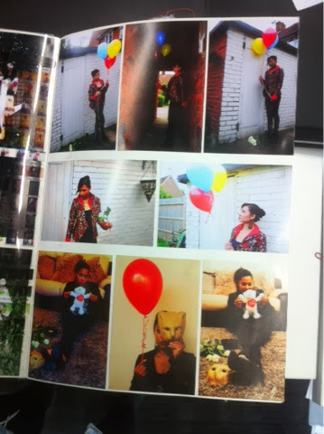
I enjoyed taking and producing the photos that were presented at the end of the week. I found it quite difficult trying to convey my personality into them without being un original or clichè. Initially I wanted to portray my dark insecure side and contrast it against my outgoing side, which almost acts as a shell. I decided I didn't want to go through with this idea because I thought the outcome would look uninteresting. Despite this, I still wanted to play around with the contrast idea and link it to the black and white monochrome trend. My new concept idea was to show my obscene side that is blurted out unexpectedly even though my friends see me as innocent. I showed this by using objects that were seen as 'bad' or deviant to exaggerate this concept. I also wanted to show how I want to keep in touch with my childish side because I feel I have lost out or grown up too quickly. I showed this by using objects associated with pureness and children. I was able to show this through styling (white and black outfits). With the black outfit, I tried to use the oriental theme/trend River Island used.
After taking the photos, I edited the photos with the black outfit with high saturation to make me look out of place. I used this same concept with the photos where I'm wearing white (saturation of colour to almost monochrome and contrast was turned high) to give the photo a grungy look. In the end, I thought the photos wearing white were the lost effecting ones and decided not to show the black outfit photos. This was because they presented a stronger message.
These photos reflected the concept images I found in a book on japanese goth, because the images were cute, with a disturbing quality to them which I thought worked for my concept. It shows how my 'innocent' persona can be seen as disturbing when I say or do something unexpected.
If I had more time, I would produce a short film because I think it would be interesting to experiment with to create certain effects. I will continue this concept throught my work because I think it works quite well, although I will adapt it to specific tasks.


A well thought through concept! I really like the gun photo!!
ReplyDeleteIt would have been nice if you had put some of your photos up on the blog so others can see them.
hannah
I like how you related the trends e.g. monochrome to demonstrate your personality through the photo editing and even the colour of your clothing.
ReplyDeleteAs I've seen your photos in person it would be good to upload them on your blog too, as you've done really nice edits.
Deanna
I really liked your photos I thought that the way you edited them emphasised your mood/theme really well and made them interesting to look at and I liked how you linked this to the trends you found, it would be good if you could post your photos as well.
ReplyDeleteKat